Litmus
A taste layer for AI.
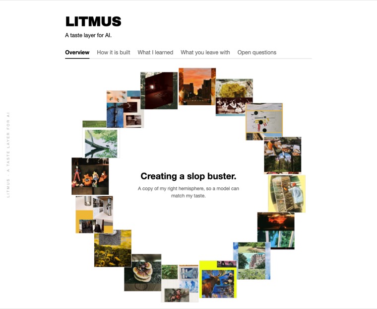
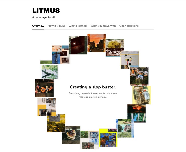
Creating a slop buster.
The sum of every small decision, written down. A taste layer for AI.
The problem
- Last semester I built a lot of interfaces with Claude.
- Each one opened with forty minutes of corrections: no purple gradient, no centred heading, no rounded corners.
- By the fifth project I was pasting the same paragraph into an empty chat.
- Building was never the problem. Ask for six versions, get six, all usable.
- It has no view on which one is worth keeping. That comes back to you every time.
- Supply no view and you get the middle of everything. That is slop.
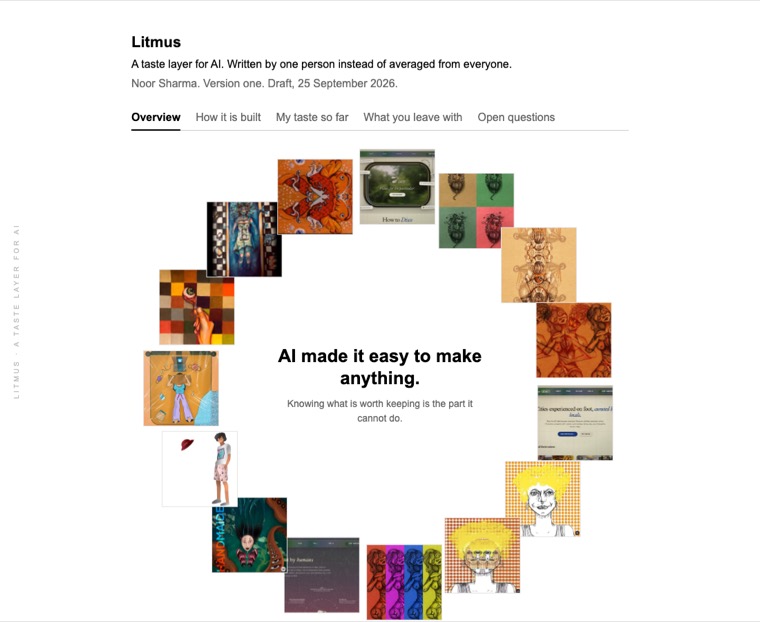
That is why we need curatorial intelligence
Unlock the full potential of your creative workflow with cutting-edge AI that seamlessly empowers you to effortlessly ship beautiful, on-brand experiences at scale.
Get started free →Lightning fast
Generate stunning results in seconds.
Fully automated
No design experience required.
Infinitely scalable
From one page to ten thousand.
Every single thing in that box is on the never list. That is the point.
What is taste
Robert Zajonc ran an experiment in 1968. He showed people shapes they had never seen before, some once, some a dozen times. They liked the ones they had seen most. Later work found it holds even when people cannot remember seeing the image at all.
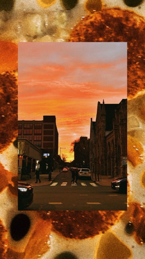
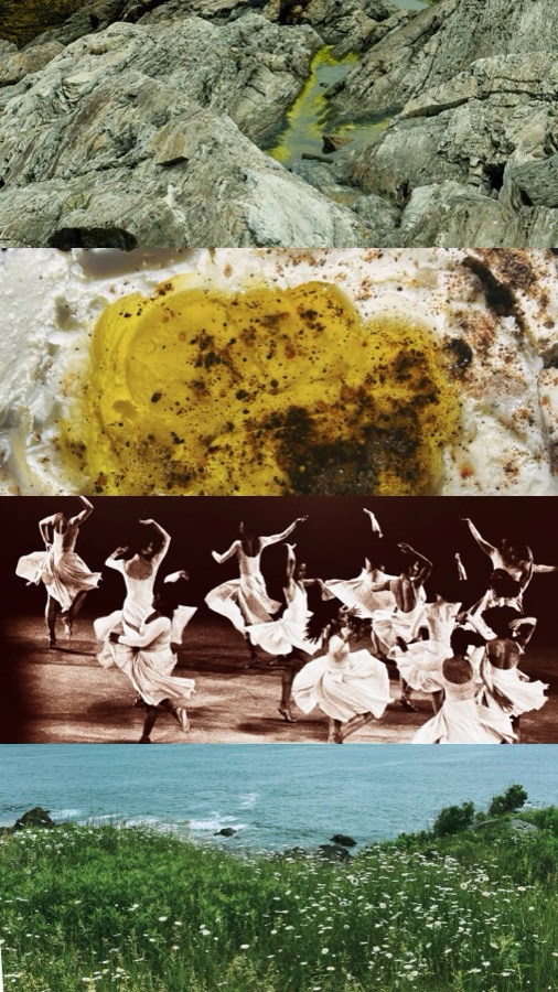
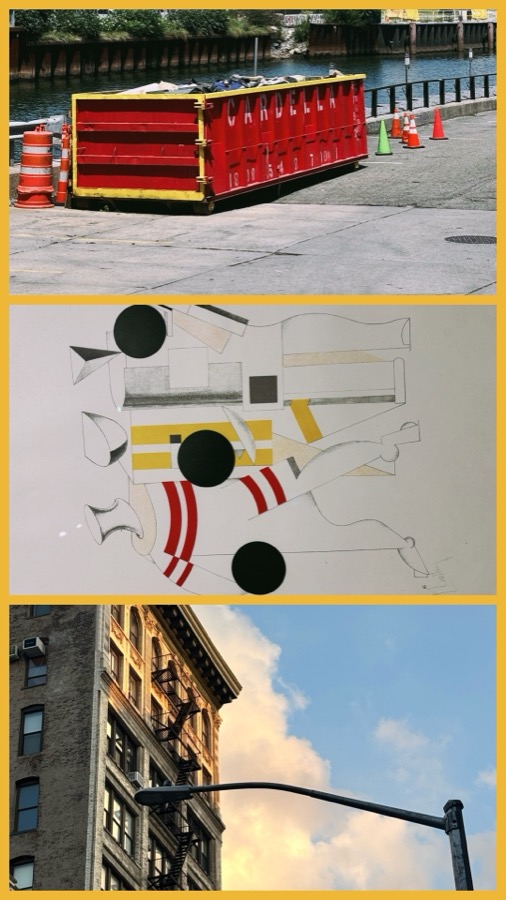
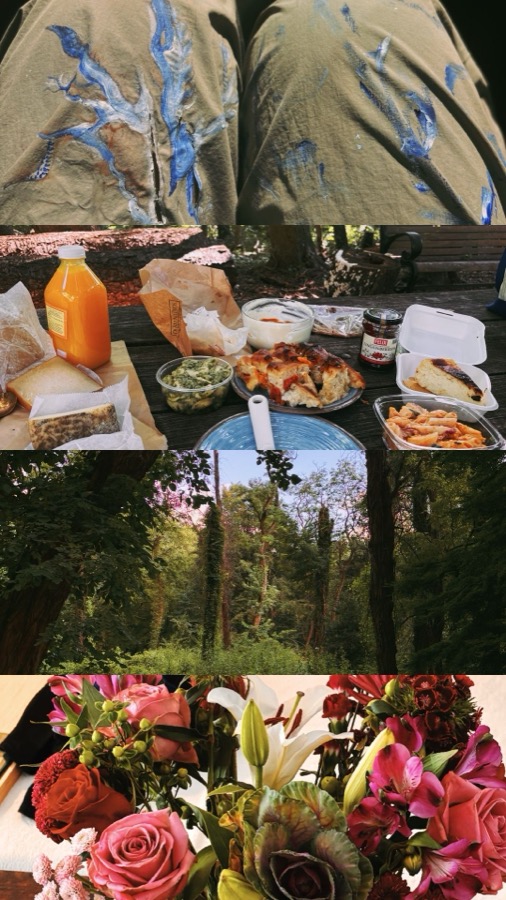
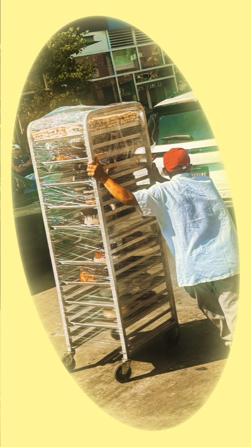
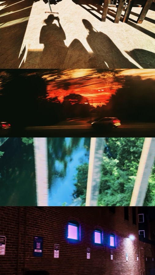
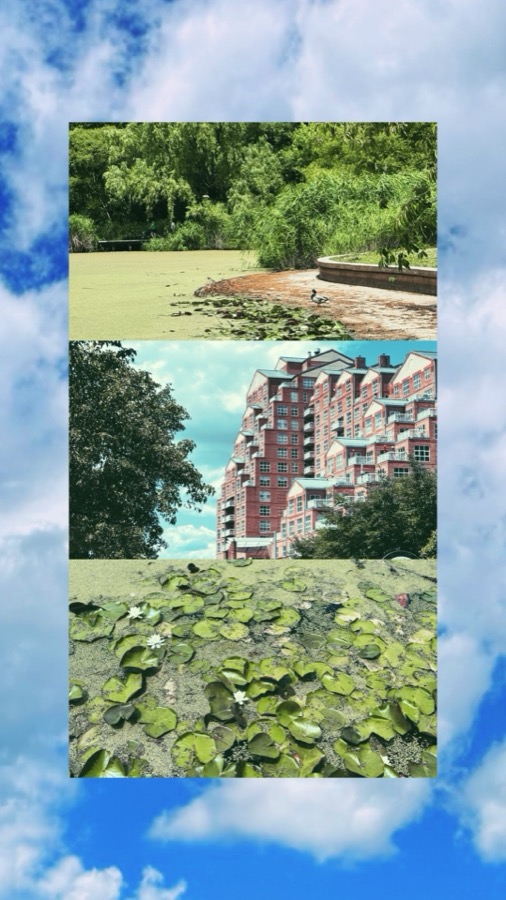
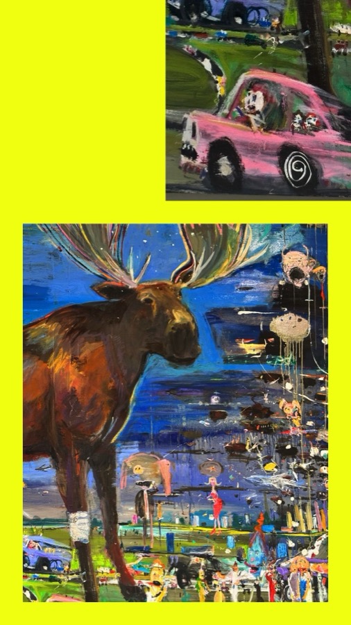
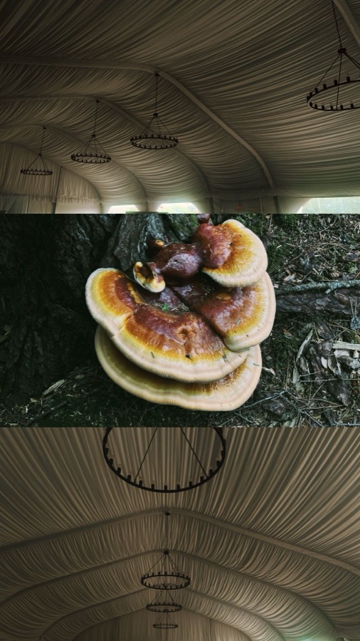
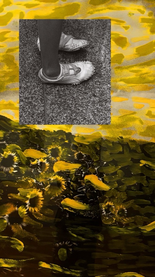
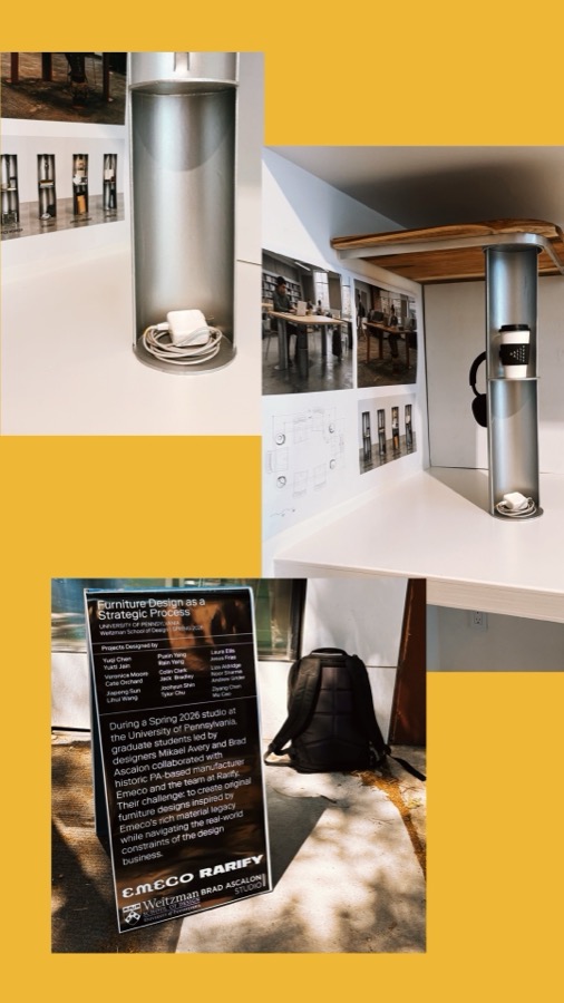
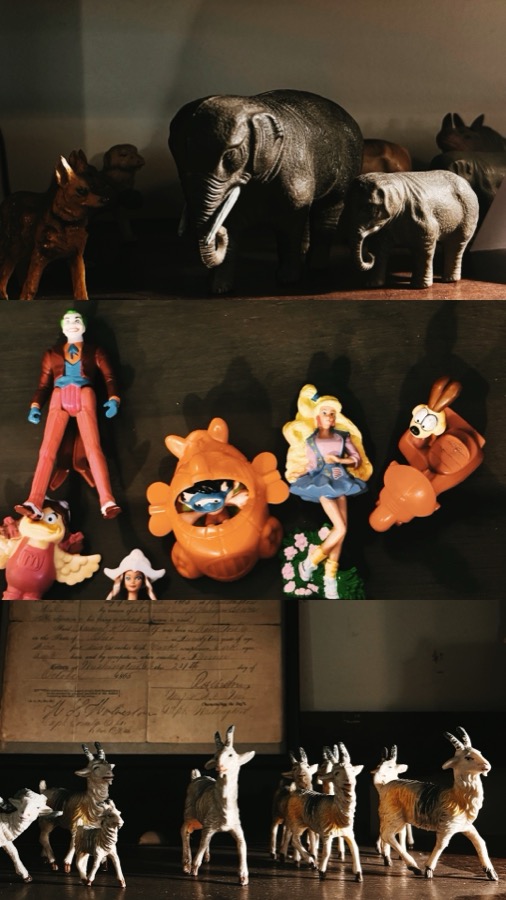
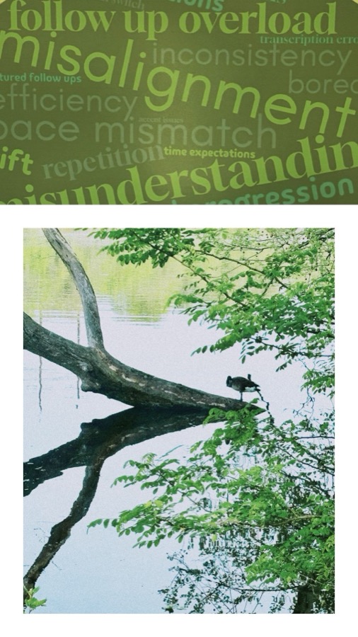
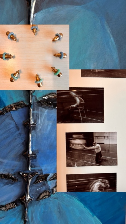
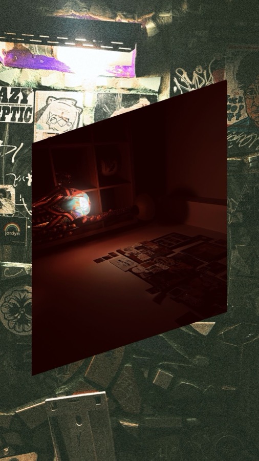
You like what you have already been looking at. My camera roll is a record of what has been around me.
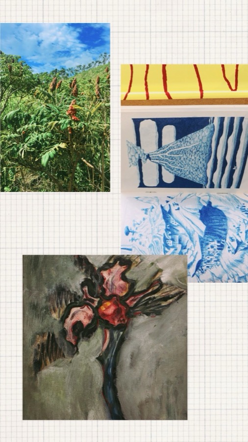
Here is mine.
Four things keep coming back. Written as instructions, because that is the form they have to end up in.
Choose the ground first and give it a treatment of its own: a colour, a texture, another image. The border is part of the work, not the space left over.
Flood the field. Never use colour to pick one element out against a neutral. Either the ground is coloured and everything sits inside it, or the page is black on white.
No centred subject, no hero image, no single focal point. Come at it from the side: the back rather than the face, the shadow rather than the person.
Same size, same crop, same weight. A screenshot sits beside an illustration with no hierarchy between them.
The idea
Taste works like a limit. What makes work yours is the long list of things you will not do. That list never gets written anywhere, so it never reaches the prompt.
Litmus writes it down. You say what you are making. Everything else is already decided.
Four things it holds
What I will not do, said outright. A model will do anything you have not forbidden, so this part comes first.
Type, colour, alignment, weight. The decisions I would otherwise retype at the start of every session.
The shape the work sits in before anything is drawn. Spacing, proportion, measure, how much air a page gets. Not tied to one kind of design, which is why it carries across a poster, a site and an email.
Every time I reject something it goes back in. The file gets closer to me the more I work, without me writing anything new.
How I am building it
I am not writing my taste down from memory. I make things and record what I decide while I make them.
Five or six pieces to start. Two websites, an image, a poster, an email. Every choice gets logged, including the ones I threw out. The thrown out ones teach it more.
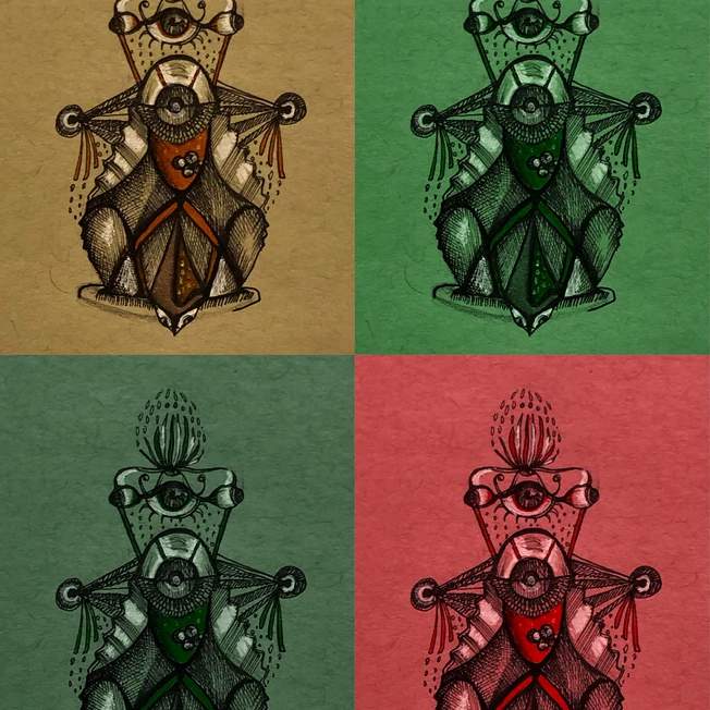
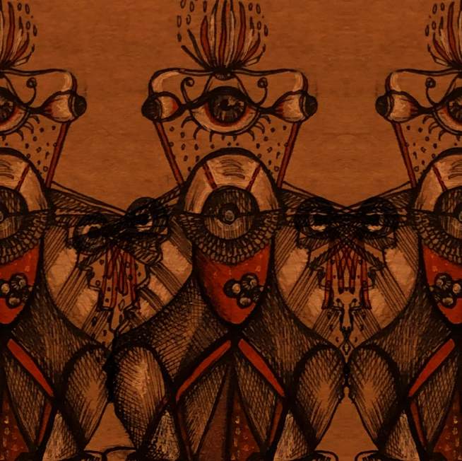
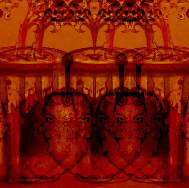
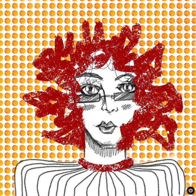
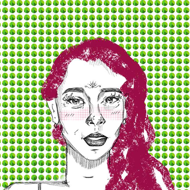
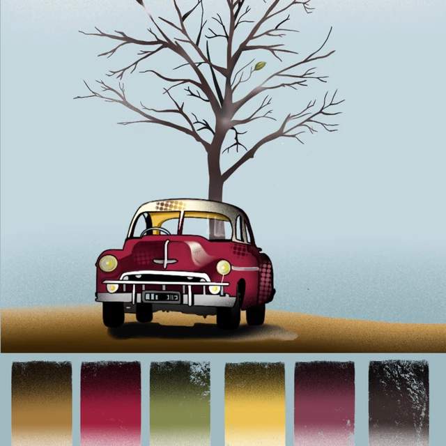
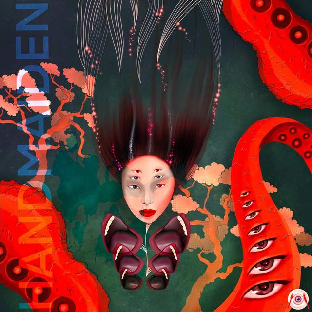
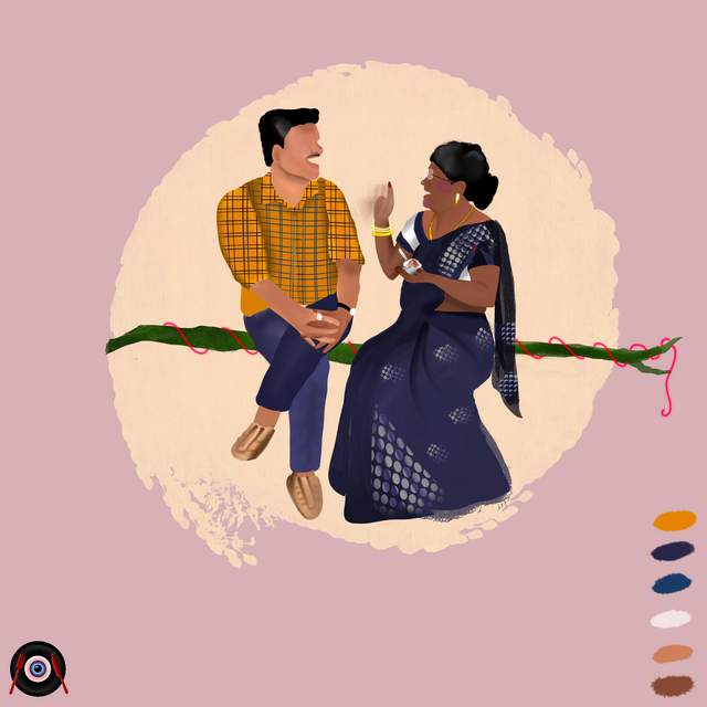

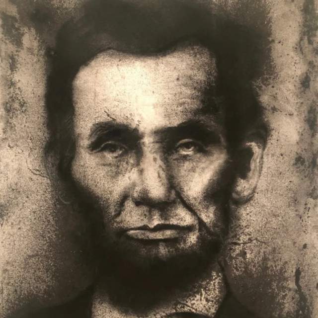
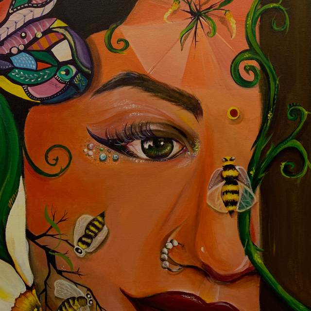
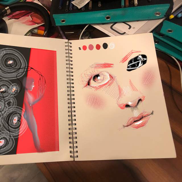
Twelve of the fifty-three pieces in my art portfolio. All drawn by hand, years before any of this. The cleanest record of what I do when nothing is instructing me.
- Design 5 or 6 things myself.
- Log every decision, kept and thrown out.
- Write the never list and the always list.
- Feed it back and mark what it got wrong.
- Write the file.
- Test it on something new.
Saved references sit underneath as background, but they are weaker. What I made says more than what I admire.
What the research says
I am not the first to try this. Four findings changed how I am building it.
What the papers found
ViPer has people comment on a handful of images saying what they like and dislike, then a model turns that into a structured list of liked and disliked attributes. Close to what I am doing, and it holds up.
Personalized Preference Fine-tuning of Diffusion Models personalises from a few ranked pairs and wins 76% of the time against the baseline. I do not need thousands of judgments.
PAMELA collected 70,000 ratings on 5,000 images, fifteen people each, and found how far one person sits from generic aesthetics can be modelled. That is exactly step 02: throw away what every designer would say and keep the gap.
Work on negative preference in recommenders shows what someone rejects constrains the answer in a way likes cannot. This is why the never list comes first in the file.
The gap in all of it: these systems learn a preference and keep it inside the model. None of them hand you a file you can read, argue with and carry to another tool.
What I learned building this page
This page was the first thing I ran the process on. I threw out four whole directions before this one. Every rule below came from something I rejected while making it.
| Rule | What happened | How sure |
|---|---|---|
| Plain white. No tint. | I tried oat paper with soft colour washes behind it. I called it AI design and cut it. | Sure |
| Ordinary type. Calibri or Arial. | Before this I tried Spectral, a fat blob display face and copperplate script. All wrong. | Sure |
| One loud thing per page at most. | Three display faces on one board was too much. One was fine. | Sure |
| Nothing in a box. | The first flowchart had boxes round every step. It looked strange straight away. | Sure |
| No texture laid over the top. | A grain overlay and blurred colour blobs went in, then came straight back out. | Sure |
| No dressing up. | The grunge version was too much. The antique script version was too grand. | Sure |
| Plain words. No borrowed sentence shapes. | "It is not this, it is that" ran through the whole page. Cut seventeen times. | Sure |
| Numbers as structure. | Numbered sections survived every version without me thinking about it. | Fairly |
| Everything to the left. | Centred layouts kept reading as templates. | Fairly |
| Motion has to be doing a job. | The circle turns. Nothing else on the page moves. | Untested |
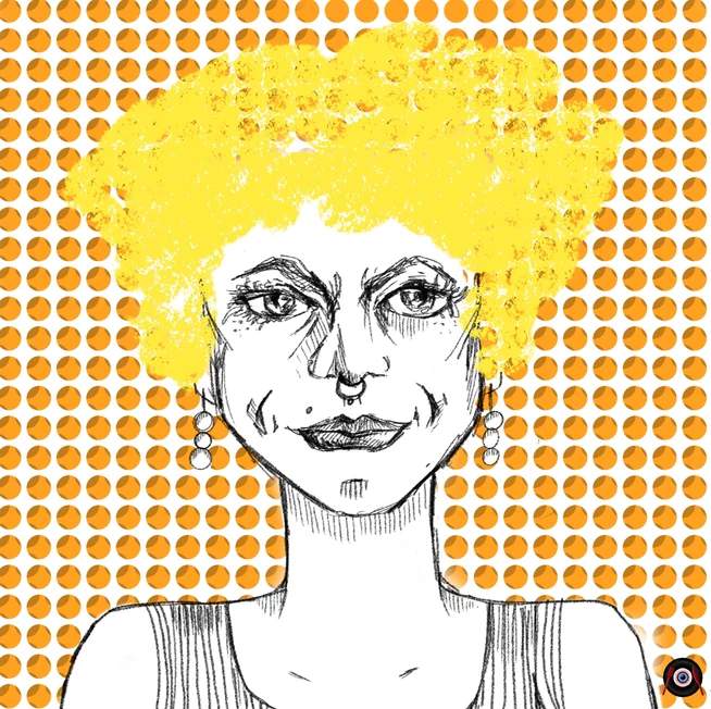
01. Plain ground. The paper is the paper.
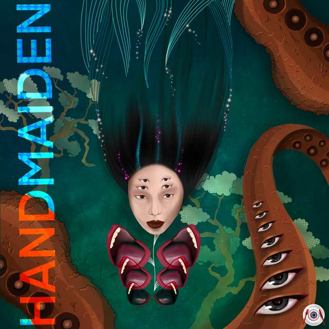
02. One loud thing. Everything else quiet.
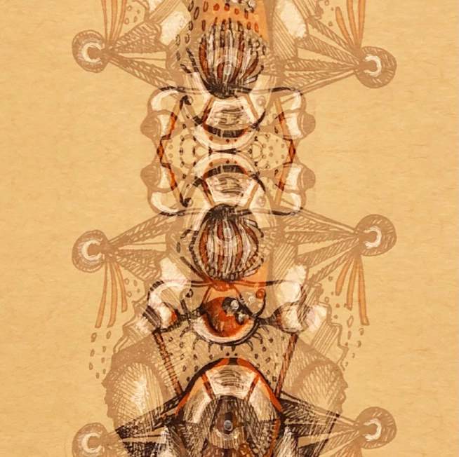
05. Nothing in a box, no shadow.
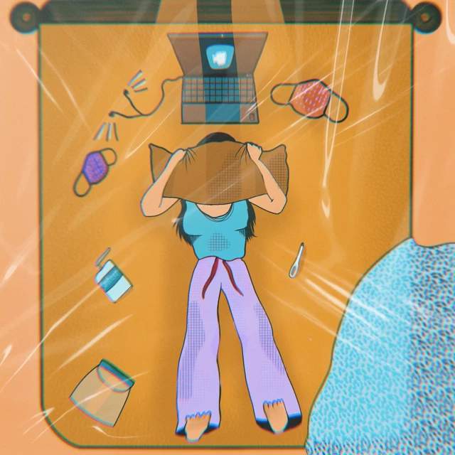
06. Texture from the material, not a filter.
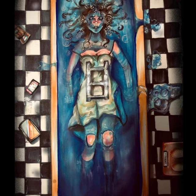
09. Nothing there only to look nice.
The same rules turn up in drawings I made years before any of this.
What the first read got wrong
The first attempt said my backgrounds are always off-white and my type should be distinctive. Both were wrong, and I only found out by seeing them built. I said so and they were rewritten.
The method is supposed to do that. The first read of anyone's taste describes good design in general. It becomes theirs once they say what it got wrong.
Before and after
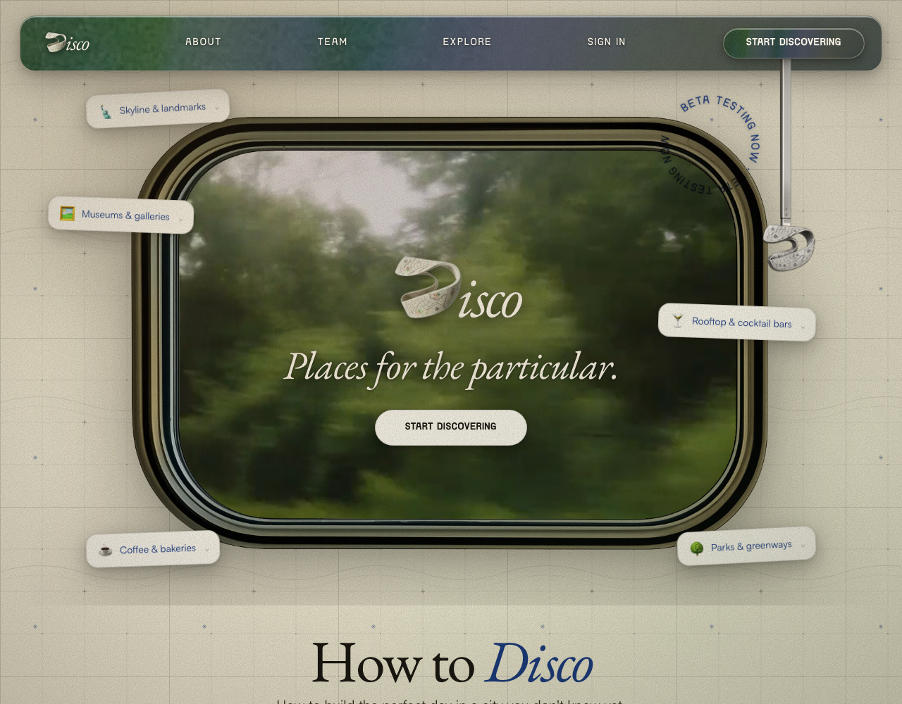
Left: a page built from a brief alone. Right: discoverdisco.com, which I designed and built. The right side is where this is meant to end up.
Without the file
Supercharge your city exploration
The all-in-one platform empowering you to discover, save and share the best places effortlessly.
Get started freeDiscover
Find hidden spots near you instantly.
Save
Build lists and never lose a place.
Share
Send picks to friends in one tap.
With the file
What you get
A prompt. Copy it, paste it, use it once. Good for a single piece.
A skill. One page of instructions you drop into a project folder. Every chat about that project then starts with your taste already loaded, and you never type the setup again. This is the one I use.
The skill is printed below. It is short because a model skims anything longer.
My taste, version two. Noor Sharma.

NEVER  no exceptions
  No rounded corners past 2px.
  No centred headline. Everything left.
  No gradients, no glow, no frosted glass, no blur.
  No drop shadows.
  No texture laid over the top. Real material or nothing.
  Nothing moves when the page scrolls.
  Never write: supercharge, effortlessly, introducing, seamless.

TYPE
  One typeface, used at many sizes. Never three typefaces.
  Body text 16px. Do not make it bigger.
  One loud element per page, at most.

COLOUR
  Background plain. Black text, full strength, not grey.
  One accent colour, used three times at most.
  Colour comes from the photographs, or not at all.

COMPOSITION
  Set things inside a field, never on a background.
  Give the ground its own treatment. The border is part of the work.
  If colour is in, it takes the whole area. No accents against neutral.
  Nothing is twice the size of anything else. No hero image.
  Drawn and photographed get the same frame, same weight.

LAYOUT
  Left aligned. One column. Numbered sections.
  Lines and rules hold the page together. Nothing floats.
  Pack it tight. Put real words on the page.

SILHOUETTE
  One measure, 640px. Do not widen it for long text.
  30px between sections. 14px between paragraphs.
  Air goes around a block, never inside it.
  Same proportions whether it is a page, a poster or an email.
How you can help
Four things I want to know
Show me what you actually type when you want an LLM to make something look a certain way. Paste it as it is, including the parts you repeat every time.
A prompt, a file, a finished page, a set of options. If this tool handed you one thing, what should it be.
Starting, choosing between versions, or finishing. I want to know where the work actually stalls for you.
When it gives you something back, how editable does it need to be. A locked answer, a starting point, or every value exposed.